Section 1:
Watercolors and properties:
A watercolor is a method of painting in which the paintings are made of pigments. The most common support of watercolor paintings is mostly paper, but it is also papyrus, bark papers, plastics, vellum or leather, fabric, wood, and canvas. Watercolors most times are transparent because the pigments are laid down, but they can be opaque by adding a Chinese white. They are formed in 4 main ingredients: pigments, gum Arabic, additives and solvents. Their name refers to paints that use water-soluble.
Water color paper, cold press and warm press:
Depending is the paper the characteristics of the paintings may change: furnish, color, weight, finish, sizing, dimensions, permanence and packaging. The difference between cold press and warm press is that the cold press has texture. Little bumps and groves holds in the water and pigment. Cold press is good when you want to convey texture in your subject. Warm press is really smooth and it does not have a texture. It allows you to re-wetting the edges of the pigment.
Why stretching watercolor paper?
Stretching a watercolor paper has an advantage because as a result we may have a nice flat work. There are four main ways to stretch the watercolor paper. You can use butcher's tape, staples, a frame and staples, or wheat paste.
Section 2:
Painting tools:
Painting knife: the painting knife is a tool made out of wood and metal the front part. It is a tool that helps the paint be more three dimensional. There are different sizes and shapes that do have different characteristics and functions.
The brayer: this is a tool that has a rolling delight, which help´s to make faster the back ground and it could be applied with multiple colors. It actually could have more transparency.
Sponge: the sponge has a soft simplicity which produces even or streaked tones, and nice, solid shapes. It also depends in the size and shape that the sponge has to create the different textures and shapes.
Painting techniques:
Ink wash painting: this technique is different from the other because it only uses black paint and to do light parts you need to put more water. In one of my paintings I would like you use this technique because for me it is interesting ant it creates a drawing kind of with shadows, and with this I could also learn how to do lighter and darkness colors just with one main color.
Wet and dry: this technique is used with wet brushes covered with a solvent which make contact with the dry paper and the ink does not expand because of the water. I would use this technique because I would like to see my paintings with the colors just mixed as a normal thing and later it would not dissolve because of the water.
Drip painting: it is an abstract art in which paint is dripped or poured onto the canvas. For me this is an interest technique that I could do as a background to make it more interesting and a unique drawing.
Under painting:
Is an initial layer of paint applied to grounds, which serves as a base for subsequent layers of paint, under paintings are often monochromatic and help to define color values for later painting. It is a system of working in layers. The colors of the under painting can be optically mingled with the subsequent over painting, without the danger of the colors physically blending and becoming muddy. If under painting is done properly, it facilitates over painting. If it seems that if one has to fight to obscure the under painting, it is a sign that it was not done properly.
Tints and shades:
The tint is the mixture of the original color with white and this creates lightness or it also can be created with more water if it is the case of watercolors. It is different from the shade because the shade is the original color mixed with black which reduces lightness.
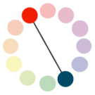
Complementary colors:
The colors that are in an opposite side in the color wheel are called complementary colors. When combined in the right proportions, produce a neutral color; white, grey, or black. When placed next to each other, they create the strongest contrast and reinforce each other.
Watercolors and properties:
A watercolor is a method of painting in which the paintings are made of pigments. The most common support of watercolor paintings is mostly paper, but it is also papyrus, bark papers, plastics, vellum or leather, fabric, wood, and canvas. Watercolors most times are transparent because the pigments are laid down, but they can be opaque by adding a Chinese white. They are formed in 4 main ingredients: pigments, gum Arabic, additives and solvents. Their name refers to paints that use water-soluble.
Water color paper, cold press and warm press:
Depending is the paper the characteristics of the paintings may change: furnish, color, weight, finish, sizing, dimensions, permanence and packaging. The difference between cold press and warm press is that the cold press has texture. Little bumps and groves holds in the water and pigment. Cold press is good when you want to convey texture in your subject. Warm press is really smooth and it does not have a texture. It allows you to re-wetting the edges of the pigment.
Why stretching watercolor paper?
Stretching a watercolor paper has an advantage because as a result we may have a nice flat work. There are four main ways to stretch the watercolor paper. You can use butcher's tape, staples, a frame and staples, or wheat paste.
Section 2:
Painting tools:
Painting knife: the painting knife is a tool made out of wood and metal the front part. It is a tool that helps the paint be more three dimensional. There are different sizes and shapes that do have different characteristics and functions.
The brayer: this is a tool that has a rolling delight, which help´s to make faster the back ground and it could be applied with multiple colors. It actually could have more transparency.
Sponge: the sponge has a soft simplicity which produces even or streaked tones, and nice, solid shapes. It also depends in the size and shape that the sponge has to create the different textures and shapes.
Painting techniques:
Ink wash painting: this technique is different from the other because it only uses black paint and to do light parts you need to put more water. In one of my paintings I would like you use this technique because for me it is interesting ant it creates a drawing kind of with shadows, and with this I could also learn how to do lighter and darkness colors just with one main color.
Wet and dry: this technique is used with wet brushes covered with a solvent which make contact with the dry paper and the ink does not expand because of the water. I would use this technique because I would like to see my paintings with the colors just mixed as a normal thing and later it would not dissolve because of the water.
Drip painting: it is an abstract art in which paint is dripped or poured onto the canvas. For me this is an interest technique that I could do as a background to make it more interesting and a unique drawing.
Under painting:
Is an initial layer of paint applied to grounds, which serves as a base for subsequent layers of paint, under paintings are often monochromatic and help to define color values for later painting. It is a system of working in layers. The colors of the under painting can be optically mingled with the subsequent over painting, without the danger of the colors physically blending and becoming muddy. If under painting is done properly, it facilitates over painting. If it seems that if one has to fight to obscure the under painting, it is a sign that it was not done properly.
Tints and shades:
The tint is the mixture of the original color with white and this creates lightness or it also can be created with more water if it is the case of watercolors. It is different from the shade because the shade is the original color mixed with black which reduces lightness.
Complementary colors:
The colors that are in an opposite side in the color wheel are called complementary colors. When combined in the right proportions, produce a neutral color; white, grey, or black. When placed next to each other, they create the strongest contrast and reinforce each other.
Color scheme:
Color scheme is the choice of colors used in design for a range of media. Color schemes are used to create style and appeal. For my project I will try to do a place where there is water, land and sea. So I am going to use blue for the water, then I am going to mix it with yellow so I can create a green between both and in the part of the sky I will use the same yellow of the land with red so they could create an orange color. In the sky and the last part of the details I will make most of it with a black color to crate the objects like if they are in shade.
Layers:
With water colors layers mean the times that you paint in the same place with the same or different colors.
Section 3:
Portrait:
A portrait is a painting, photograph, sculpture, or other artistic representation of a person, in which the face and its expression is predominant. The intent is to display the likeness, personality, and even the mood of the person.
Landscape:
It is a drawing that shows all the features of an area of the land including geographical features such as river, mountains, hills, rivers, lakes, etc… it includes vegetation and human elements like buildings or others.
Still life:
Is a work of art depicting mostly inanimate subject matter, typically commonplace objects which may be either natural or man-made.
Realistic art:
Realistic art is art that takes as its subject real objects, scenes, events, people and situations that exist in the world, and attempts to render them mostly as they actually are to our visual sense, as well as to our emotions and mind. For example, in realistic are, we see paintings of people, animals, landscapes, battles, furniture, fruit and other animate and inanimate objects pretty much to look like them.
Abstract art:
Though the artist renders objects, people, ideas, feelings, emotions, dreams, or other subjects in abstract ways, without being bound to what they actually look like visually.
Non-objective art:
Is another way to refer to Abstract art or nonrepresentational art. Essentially, the artwork does not represent or depict a person, place or thing in the natural world. Usually, the content of the work is its color, shapes, brushstrokes, size, scale, and, in some cases, its process.
Imitationalism:
Imitationalism applies to artworks that look realistic. These artworks contain recognizable, realistic looking objects and scenes that closely imitate what we see in the real world.
Emontionalism:
Emotionalism stresses the expressive qualities in an artwork. The primary purpose of an emotionalist artwork is to vividly communicate moods, feelings and ideas to the viewer.
Formalism:
Formalism stresses the visual qualities of an artwork. The focus is on the effective arrangements of lines, colors, shapes and other elements of art
